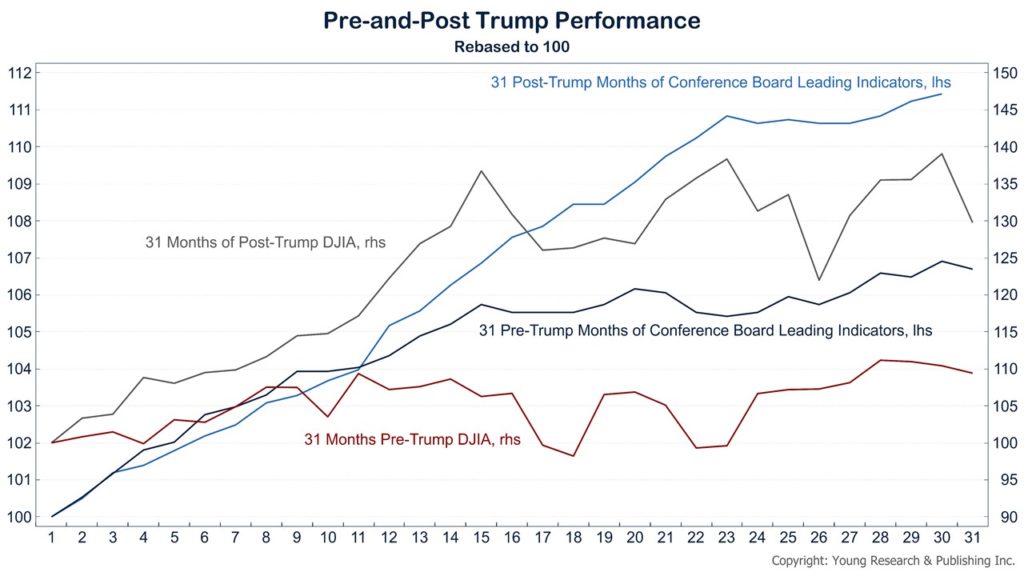
On this chart you can see what has come to be known as the “Trump Effect.”
In dark grey and light blue you can see the performance of the Dow Jones Industrial Average and the Conference Board’s Leading Economic Index after November 2016 when Trump was elected.
In red and dark blue you can see the performance of each of those indicators in the 31 months leading up to the election. All the series have been rebased to 100 for comparison.